I spent two hours on my first venus planet drawing in high school, and my art teacher asked if it was supposed to be a tennis ball. That crushing feedback sent me down a rabbit hole of planetary art that changed how I see space illustration forever. The truth is, Venus demands specific techniques that most beginners miss—from capturing its thick cloud layers to nailing that signature yellowish-white glow that makes it Earth’s “evil twin.”
I drew Venus with soft, swirling lines, feeling as if my own emotions were trapped beneath its clouds.
Stay tuned with us as we explore Venus planet drawing, where creativity meets space science.
Five Essential Elements Every Venus Planet Drawing Needs
Let’s start with what actually makes Venus recognizable.
Most people draw Venus like they draw any planet: a circle with some shading. That’s like drawing a portrait by sketching an oval and calling it done.
Venus has distinct visual characteristics that separate it from every other planet in our solar system. Miss these, and you’ve just drawn a generic sphere.
The non-negotiables for any venus planet drawing:
- Dense cloud coverage: No visible surface features (unlike Mars or Earth)
- Yellowish-cream color palette: Not pure white, not gray
- Subtle atmospheric bands: Faint horizontal striations in the clouds
- Smooth gradients: No sharp edges or dramatic contrasts
- Consistent brightness: Venus is the third-brightest object in Earth’s sky
I learned this the hard way after my tennis ball incident. I studied NASA images from the Mariner, Pioneer Venus, and Magellan missions for weeks. Venus doesn’t have the obvious red spot of Jupiter or the rings of Saturn. Its beauty lies in subtlety.
The key insight: Venus is challenging because it looks simple. Creating a convincing venus planet drawing means mastering soft transitions and understanding atmospheric perspective.
| Drawing Element | Beginner Mistake | Correct Approach |
| Color | Pure white or gray | Cream/yellowish-white with subtle variations |
| Texture | Smooth or heavily cratered | Soft, billowy cloud textures |
| Contrast | High contrast shading | Gentle, gradual transitions |
| Details | Adding surface features | Keeping it atmospheric only |
| Brightness | Making it dim | Venus is intensely bright |
Here’s something that changed my approach completely: Venus reflects about 75% of the sunlight that hits it. That’s an albedo higher than fresh snow. Your venus planet drawing should feel luminous, almost glowing.
Step-by-Step Process for Drawing Venus Realistically
Now for the practical part that actually works.
I’ve refined this process over hundreds of drawings. It works with pencils, digital tools, paints—basically any medium.
Step 1: Create the base sphere
Start with a perfect circle. Use a compass, trace a circular object, or use the ellipse tool in digital software. Venus is nearly spherical (it’s actually slightly oblate, but this is invisible in drawings).
Step 2: Establish your light source
Decide where your sunlight comes from. Typically, this is from the upper left or upper right in most venus planet drawing compositions. Mark this lightly—everything else depends on it.
Step 3: Apply base color
Use a pale yellow or cream color. I typically mix white with tiny amounts of yellow and the slightest hint of orange. The color should whisper “warm” without shouting “egg yolk.”
For digital work, I start with hex code #FFF8DC (cornsilk) and adjust from there.
Step 4: Add the terminator zone
The terminator is the line between day and night. On Venus, this transition is extremely soft because the thick atmosphere scatters light. Create a gradient from your base color to a slightly darker cream-gray.
Step 5: Build atmospheric bands
This is where your venus planet drawing comes alive. Add subtle horizontal bands suggesting atmospheric circulation. These should be barely visible—if someone asks “are those bands or am I imagining them?” you’ve nailed it.
Use a slightly darker version of your base color. The bands should flow horizontally with gentle curves following the sphere’s contour.
Step 6: Add cloud texture
Venus’s clouds are sulfuric acid droplets creating a soft, billowy appearance. Avoid hard edges. Think cotton balls, not rocks. Use gentle circular or swirling motions to suggest cloud formations.
Step 7: Enhance the bright side
The side facing your light source should be brighter but not stark white. Add a soft highlight—not a sharp specular highlight like you’d see on a chrome ball, but a gentle luminous area.
Step 8: Deepen the shadow side
The shadowed side of Venus should transition to a cream-beige or very pale brown. Never go to pure black or dark gray. Venus’s atmosphere scatters so much light that even the night side has illumination.
Materials that work best for venus planet drawing:
- Pencils: 2H, HB, 2B, 4B for gradual value shifts
- Digital: Soft airbrush tool with pressure sensitivity
- Paint: Acrylics with plenty of white for mixing subtle tones
- Pastels: Chalk or oil pastels for soft blending
One trick I discovered: work from light to dark. It’s easier to add shadow than to recover blown-out highlights.
Color Theory and Why Venus Isn’t Actually Yellow
This misconception trips up most people attempting a venus planet drawing.
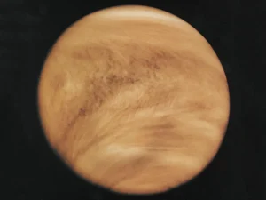
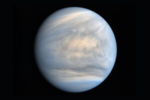
Venus appears yellowish-white to our eyes from Earth. But when spacecraft get close, the reality is more complex.
The planet itself (the solid surface beneath the clouds) has reddish-orange rocks. But you never see those. The clouds are made of sulfuric acid droplets that reflect light across the spectrum pretty evenly—hence the whitish appearance.
So where does the yellow come from?
The atmospheric effect:
When we observe Venus from Earth, we’re looking through two atmospheres—Venus’s and our own. Earth’s atmosphere scatters blue light (why our sky is blue), which slightly warms the color of light passing through it. This adds a subtle yellowish cast to Venus’s appearance.
In spacecraft images taken in visible light, Venus appears almost pure white. In ultraviolet, it shows dramatic dark patterns from sulfur dioxide absorbing UV radiation.
For a venus planet drawing meant to capture how it appears from Earth, use that cream-yellow tone. For a close-up as seen by a spacecraft, lean toward brighter white with maybe just a hint of warmth.
Color palette recommendations:
- Base color: Cream white (RAL 9001 or similar)
- Shadow areas: Warm gray or beige
- Highlight areas: Pale yellow-white
- Cloud bands: Slightly darker cream (10-15% value difference)
I use a limited palette—usually five shades maximum. Venus’s subtlety demands restraint. When I first started, I’d add too many colors trying to make it “interesting.” The result looked muddy and unrealistic.
Digital vs. Traditional Techniques for Venus
Both approaches have advantages for creating a venus planet drawing.
I work in both mediums regularly, and each teaches different lessons.
Traditional media advantages:
Traditional drawing forces you to commit. You can’t easily undo a mark, which teaches careful observation and planning. Blending with stumps (for pencil) or fingers (for pastels) creates organic, natural-looking atmospheric effects that are hard to replicate digitally.
Graphite pencils excel at creating Venus’s subtle value shifts. Start with light pressure using an HB or 2H pencil, gradually building darker tones with 2B and 4B. Blend with a blending stump or tissue.
For colored pencils, layer lightly. Use white, cream, pale yellow, and light gray. Build up slowly—20 light layers beats 5 heavy ones.
Digital advantages:
Digital tools offer non-destructive editing. You can try different approaches, adjust colors globally, and refine details without starting over.
For a venus planet drawing in digital format, I use these layer strategies:
- Base sphere layer with gradient
- Cloud texture layer (set to soft light or overlay at 30-50% opacity)
- Atmospheric bands layer (multiply mode, low opacity)
- Highlight layer (screen or add mode)
- Adjustment layers for final color tweaking
Software like Photoshop, Procreate, or free alternatives like Krita all work well. The key is using a soft airbrush with pressure sensitivity and working on separate layers.
| Aspect | Traditional | Digital |
| Blending quality | Organic, natural | Can look artificial if not careful |
| Corrections | Difficult/impossible | Easy, non-destructive |
| Color accuracy | Depends on materials | Precise, consistent |
| Learning curve | Steeper initially | More forgiving for beginners |
| Final output | Physical artwork | Requires printing for physical form |
| Tools needed | Pencils, paper, blending tools | Tablet, stylus, software |
Hybrid approach:
My favorite method combines both. I sketch and plan traditionally, scan it, then finish digitally. This gives me the natural feel of hand-drawing with the flexibility of digital refinement.
Reference Images and What They Actually Show
NASA provides incredible resources for any venus planet drawing, but you need to understand what you’re looking at.
Most publicly available Venus images aren’t in “true color”—they’re false color, enhanced, or taken in wavelengths outside visible light.
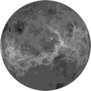
Types of Venus imagery:
- UV images: Show dark bands from sulfur dioxide (Akatsuki, Venus Express)
- Radar maps: Show surface features through clouds (Magellan mission)
- Visible light: Appear mostly featureless white (Pioneer Venus)
- Infrared: Show thermal emissions and cloud structure
For a realistic venus planet drawing representing visual observation, use visible light references. The best come from:
- Pioneer Venus Orbiter (1978-1992)
- Mariner 10 flyby (1974)
- Earth-based telescopic observations
- Venus Express (2006-2014) visible light images
When I browse NASA’s image galleries, I specifically filter for “visible” or “true color” images. The UV images are scientifically valuable but look nothing like what human eyes would see.
Common reference pitfalls:
Artists often use radar maps (which show surface topography) or UV images (which show dramatic cloud patterns) for their venus planet drawing. The result looks cool but unrealistic—you’re drawing features invisible to human vision.
One helpful resource: compare multiple images from different missions. You’ll notice the consistency in Venus’s overall appearance—that soft, cream-colored, subtly banded atmosphere.
Advanced Techniques for Professional Results
Once you’ve mastered the basics, these techniques elevate your venus planet drawing to publication quality.
Technique 1: Atmospheric scattering
Venus’s thick atmosphere creates a phenomenon called limb brightening. The edges of the planet often appear brighter than expected because you’re looking through more atmosphere at a shallow angle.
Add a subtle bright ring around the planet’s edge, especially on the illuminated side. This should be soft—barely noticeable but present.
Technique 2: Phase representation
Venus shows phases like the Moon when viewed from Earth. A venus planet drawing can show it as:
- Crescent (near inferior conjunction with Earth)
- Half-phase (maximum elongation)
- Gibbous (farther from Earth)
- Full (behind the Sun from Earth’s perspective—not visible)
Adjust your terminator position to show the desired phase. Remember, Venus appears largest when in crescent phase and smallest when full (but then it’s behind the Sun).
Technique 3: Context elements
A standalone sphere can look flat. Add context:
- Stars in the background (keep them subtle—Venus is bright)
- Size comparison with Earth or the Moon
- Position in space with the Sun visible
- Spacecraft for scale (Magellan, Akatsuki, etc.)
Technique 4: Multiple light sources
In space, Venus receives light primarily from the Sun. But for artistic purposes, some venus planet drawing compositions include:
- Earthshine (light reflected from Earth)
- Secondary ambient light for atmosphere
- Rim lighting to separate the planet from the background
Be careful here—too many light sources look artificial. Use them subtly.
Technique 5: Detail in subtlety
Professional venus planet drawing work shows restraint. Instead of adding more details, refine the subtle elements:
- Make gradients smoother
- Ensure atmospheric bands follow spherical perspective
- Check that shadows have soft edges
- Verify color temperature consistency
What I Learned the Hard Way
That tennis ball comment haunted me for months.
I’d spent hours on that venus planet drawing, carefully shading every detail, adding craters and surface features from imagination. It looked detailed and intricate. It also looked nothing like Venus.
My biggest mistakes:
- Error 1: Adding surface details I didn’t realize Venus’s clouds completely hide its surface. The craters and mountains I carefully drew don’t exist in visual observation. I was drawing Mars but calling it Venus.
- Error 2: Using pure white I thought “brightest planet” meant “white like paper.” My drawing looked like a flat circle with no dimension. Venus’s subtle cream tone is what gives it character.
- Error 3: Over-contrasting I used heavy black shadows trying to show sphere form. Venus has the softest transitions of any planet. My harsh shadows betrayed ignorance of atmospheric scattering.
- Error 4: Ignoring reference images I worked from memory and imagination. When I finally compared my drawing to NASA images, the disconnect was embarrassing. Reference isn’t cheating—it’s essential.
The real breakthrough came when I stopped trying to make Venus “interesting” through added details. I learned that subtlety is interesting when executed well.
I redrew Venus a dozen times after that first failure. Each version got simpler in concept but more refined in execution. By the tenth attempt, I’d learned that a great venus planet drawing needs fewer elements than I thought—but those elements need to be perfect.
One technique that finally clicked: I stopped drawing “details” and started drawing “light behavior.” Once I understood how light interacts with atmospheric particles, my Venus drawings transformed.
The emotional lesson hit harder. That art teacher’s comment (which was honestly fair) could have stopped me from trying. Instead, it became fuel. Every artist gets harsh feedback. The ones who improve are the ones who use it as a starting point rather than an ending.
Common Mistakes and How to Avoid Them
I see these errors constantly in student work and online tutorials.
Mistake 1: Making it too gray
Venus isn’t gray. Gray suggests lack of warmth and illumination. Even the shadow side should have warm undertones. Use beige, cream, or pale tan—never cold gray.
Mistake 2: Sharp cloud edges
Venus’s clouds are diffuse. If your cloud formations have crisp boundaries, they look like rocks or continents, not atmosphere. Everything should fade and blend.
Mistake 3: Symmetrical bands
Real atmospheric circulation isn’t perfectly regular. Your bands should have subtle variations in spacing, thickness, and tone. Symmetry looks artificial.
Mistake 4: Wrong proportions
Venus is almost the same size as Earth (95% of Earth’s diameter). If you’re drawing both, get the proportions right. I’ve seen venus planet drawing compositions where Venus is shown smaller than Mars—that’s backwards.
Mistake 5: Forgetting the glow
Venus should feel luminous. It reflects 75% of incoming sunlight. Your drawing should suggest this brightness. Use a lighter background near the planet or add a subtle halo effect.
Quick fixes:
- Too gray? Add yellow/cream glazes or overlays
- Too sharp? Blur edges using blending tools or soft erasers
- Too symmetrical? Introduce randomness in band placement
- Wrong size? Use reference circles as templates
- No glow? Lighten the background immediately around the planet
Creating a Full Solar System Context
A venus planet drawing often appears in larger compositions showing the solar system.
Venus occupies specific positions and relationships worth understanding:
Position: Second planet from the Sun
- Mercury (closer)
- Venus
- Earth (farther)
- Mars (farther still)
Size relationships: When drawing the inner planets together:
| Planet | Relative Diameter | Color | Key Feature |
| Mercury | 0.38x Earth | Gray | Heavily cratered |
| Venus | 0.95x Earth | Cream-yellow | Cloud-covered |
| Earth | 1.0x Earth | Blue-white | Oceans visible |
| Mars | 0.53x Earth | Red-orange | Polar ice caps |
In a lineup, Venus should be nearly identical in size to Earth. This surprises people who expect more variation.
Orbital considerations:
Venus orbits 67 million miles from the Sun (Earth is 93 million miles). In a scale drawing showing orbits, Venus sits roughly 72% of the way from the Sun to Earth.
Venus’s orbit is nearly circular (eccentricity of 0.007), making it the most circular planetary orbit in the solar system.
Tools and Materials for Different Skill Levels
Not everyone needs professional art supplies for a great venus planet drawing.
Beginner setup ($10-30):
- Basic pencil set (HB, 2B, 4B)
- Blending stumps or cotton swabs
- Kneaded eraser
- Smooth drawing paper (Bristol or sketchbook)
- Compass or circular template
This minimal kit produces excellent results. I’ve created publication-worthy venus planet drawing work with nothing more than these basics.
Intermediate setup ($50-100):
- Expanded pencil range (2H through 6B)
- Professional blending stumps
- White charcoal or chalk for highlights
- Toned paper (cream or light gray)
- Drawing fixative
- Quality colored pencils (Prismacolor or similar)
Advanced setup ($100-300+):
- Professional pencil sets
- Airbrush system (for ultra-smooth gradients)
- Acrylic or oil paints
- Canvas or illustration board
- Digital tablet (Wacom, iPad Pro, etc.)
- Professional software (Adobe Creative Suite, Procreate)
Digital-specific tools:
For digital venus planet drawing, I recommend:
- Tablet with pressure sensitivity (essential)
- Minimum 2048 pressure levels
- Screen size 10″ or larger
- Software with layer support and soft brushes
Free alternatives work fine for learning: Krita, GIMP (with plugins), or even basic tools in Photoshop alternatives.
The most important tool isn’t on this list—it’s reference images. A beginner with good references will outperform an advanced artist working from imagination.
Conclusion
Your venus planet drawing shouldn’t look like a tennis ball—it should capture the subtle, luminous beauty of our nearest planetary neighbor. Master those soft transitions, embrace the cream-yellow palette, and remember that Venus proves sometimes the most challenging subjects are the simplest in appearance.
Frequently Asked Questions
1. What colors should I use?
Use pale cream or yellow-white tones with subtle warm grays for shadows. Avoid pure white or bright yellow. Gentle gradients and 3–5 warm shades work best.
2. How do I show Venus’s clouds accurately?
Draw soft, horizontal atmospheric bands with subtle variations. Avoid puffy or stormy clouds; blend tones gently for a smooth, frosted-glass effect.
3. Should I add surface features?
No. Venus’s thick clouds hide the surface. Focus only on atmospheric bands and soft gradients.
4. How do I make it look 3D?
Use a clear light source, soft gradients, subtle limb brightening, and a gentle terminator. Avoid harsh shadows or over-contrasting edges.
5. How can I practice?
Study NASA reference images, practice spheres with smooth shading, and draw Venus repeatedly at different phases and mediums.
6. Which tools work best?
Pencils, blending stumps, digital soft brushes, or airbrush tools. Focus on subtle layering rather than harsh marks.
7. How do I handle highlights?
Keep them very soft and warm. Venus reflects a lot of sunlight, so bright areas should feel luminous without stark white.
8. What common mistakes should I avoid?
Adding craters, sharp edges, high contrast shadows, or puffy clouds. Over-detailing destroys Venus’s soft, subtle look.
Final Summary
Final Summary: Creating a venus planet drawing focuses on subtlety. Use soft cream-yellow tones, gentle gradients, and diffuse cloud textures. Avoid surface details, harsh edges, or over-contrasting shadows. Respect the sphere’s form, terminator, and limb brightening. Whether traditional or digital, build up layers gradually and reference real images. Mastering venus planet drawing teaches value control, atmospheric effects, and subtlety. A good venus planet drawing balances luminosity, warm tones, and realism, showing that simplicity often demands the most refined technique. Patience and restraint are key in any successful venus planet drawing.