I spent three hours on my first Uranus drawing for an astronomy project in college, and my professor asked if I’d traced a marble. That stinging feedback launched me into a journey of understanding what makes this ice giant so challenging—and rewarding—to draw accurately. The subtle atmospheric bands, the unique cyan color, and the barely-there features require techniques most art tutorials completely miss.
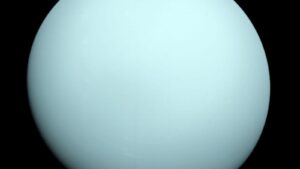
While attempting my first Uranus drawing, I realized how deceptively simple the planet looks, yet capturing its pale cyan-blue required careful layering.
Stay tuned with us—we will talk about Uranus drawings and explore tips, colors, and techniques to capture the ice giant’s subtle, beautiful atmosphere accurately.
Five Essential Elements Every Uranus Drawing Needs to Look Authentic
Let’s start with what actually makes Uranus recognizable as Uranus.
Most people approach a Uranus drawing the same way they’d draw any planet: circle, shade, done. That creates a generic blue ball that could be anything.
Uranus has specific visual characteristics that separate it from every other planet in our solar system. Miss these, and you’ve just drawn Neptune’s cousin or a colored circle.
Element 1: The Precise Cyan-Blue Color
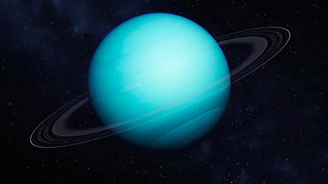
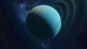
Uranus isn’t bright blue like Neptune. It’s a pale cyan or blue-green that’s distinctly lighter and more muted.
This color comes from methane in the upper atmosphere absorbing red wavelengths while reflecting blue and green light. But here’s the key: Uranus appears lighter than Neptune despite similar methane concentrations because it has a thicker haze layer.
Color mixing for traditional media:
- Start with white
- Add small amounts of cyan or turquoise
- Mix in tiny amounts of green (less than you think)
- The result should whisper “blue-green” not shout it
Digital color codes:
- Base color: #4FD0E7 or similar pale cyan
- Highlight: #7DE5F5 (lighter cyan-white)
- Shadow: #3BA7BC (deeper cyan-blue)
Element 2: Subtle Atmospheric Bands
Unlike Jupiter’s dramatic stripes or Saturn’s rings, Uranus shows extremely faint atmospheric banding. These bands are barely visible in most images because Voyager 2 visited during an unusually quiet period.
For an accurate Uranus drawing, add horizontal bands so subtle that viewers question whether they’re actually there. If someone asks, “Are those bands, or am I imagining them?” you’ve nailed it.
Element 3: Smooth Gradients
Uranus lacks the sharp features, spots, or dramatic storms visible on gas giants. Everything blends smoothly.
Your Uranus drawing should have gentle transitions from light to dark with no hard edges. Think watercolor diffusion, not marker lines.
Element 4: The Correct Lighting
Because Uranus rotates on its side (98-degree axial tilt), its poles face the Sun during different seasons. Your lighting should reflect this unusual orientation.
For a typical Uranus drawing showing the planet during its orbit, the illuminated area might be:
- Top or bottom of the sphere (polar view)
- Traditional side lighting (equatorial view)
- Somewhere in between
Element 5: Appropriate Size Context
Uranus is the third-largest planet in our solar system—about four times Earth’s diameter. If you’re drawing it in relation to other planets, get the proportions right.
Too many Uranus drawing examples show it smaller than it should be, making it look insignificant when it’s actually massive.
| Essential Element | Common Mistake | Correct Approach |
| Color | Bright blue like Neptune | Pale cyan-blue with green hints |
| Bands | No bands or overly obvious | Extremely subtle horizontal striations |
| Texture | Smooth or heavily detailed | Gentle atmospheric suggestions |
| Contrast | High-contrast shading | Soft, low-contrast gradients |
| Features | Adding spots or storms | Keeping it relatively featureless |
Understanding these elements transforms a Uranus drawing from a generic sphere to a recognizable ice giant.
Step-by-Step Process for Drawing Uranus Realistically
Here’s the practical method that works across all media.
I’ve refined this process through hundreds of planetary drawings. It works whether you’re using pencils, paints, pastels, or digital tools.
Step 1: Create Your Base Circle
Start with a perfect circle. Use a compass, trace a circular object, or use the ellipse tool in digital software.
Uranus is slightly oblate (flattened at the poles), but this is barely noticeable in drawings. A perfect circle works fine for most Uranus drawing projects.
Step 2: Establish Your Light Source
Decide where your sunlight comes from. Mark this lightly with a small indicator outside your circle.
For a Uranus drawing, I typically place the light source upper-left or upper-right to create familiar viewing angles. Remember, the unusual axial tilt means you might be looking at a pole rather than the equator.
Step 3: Apply Base Color
For traditional media:
- Start with a very light wash or layer of pale blue-green
- Build gradually—you can always darken, but lightening is difficult
- Keep it lighter than your instinct suggests
For digital:
- Fill with base color around #4FD0E7
- Create this on a separate layer for flexibility
- Keep opacity around 80-90% initially
Step 4: Add the Terminator Gradient
The terminator is the transition between day and night. On Uranus, this transition is extremely soft because the thick atmosphere scatters light extensively.
Create a gradient from your base color to a slightly darker cyan-blue. This gradient should span at least 1/3 of the planet’s width—Uranus’s atmosphere makes the shadow side unusually bright.
Step 5: Build Atmospheric Bands (Subtly)
This is where most uranus drawing attempts fail. People either skip bands entirely or make them too obvious.
Add faint horizontal bands using a color just 5-10% darker than your base. These bands should:
- Flow horizontally (parallel to the equator)
- Curve following the sphere’s contour
- Be barely visible—seriously, barely
- Have soft eUranusat blend into surrounding atmosphere
Step 6: Create Cloud Texture
Uranus’s haze creates a soft, diffuse appearance without distinct cloud formations.
Add subtle texture suggesting atmospheric depth:
- Small variations in tone and value
- Gentle swirling motions (very subtle)
- No hard-edged clouds or spots
- Everything blends smoothly
Step 7: Add Highlights
The illuminated side needs gentle brightening, not a sharp specular highlight.
Create a soft, diffuse bright area on the sunlit side. This should:
- Blend gradually into the base color
- Not be pure white—use a lighter cyan
- Span a large area rather than being a small bright spot
- Feel atmospheric rather than reflective
Step 8: Deepen the Shadow Side
The dark side of Uranus should transition to a deeper cyan-blue but never approach black.
Even in shadow, Uranus shows color because of atmospheric scattering. Use deeper blue-green tones, not gray or black.
Materials that work best for Uranus drawings:
- Colored pencils: Soft-core pencils like Prismacolor for blending
- Pastels: Excellent for the soft, atmospheric quality
- Watercolor: Perfect for subtle gradients and washes
- Digital: Soft airbrush with pressure sensitivity
- Acrylic: Requires patience for glazing and blending
One technique I discovered: working from light to dark prevents muddying. Uranus’s pale colors show every mistake in overworking.
Color Theory and Reference Images for Accurate Uranus Drawings
Getting the color right is half the battle in a Uranus drawing.
Uranus appears cyan-blue in true color images, but understanding why helps you replicate it accurately.
The atmospheric chemistry:
Uranus’s upper atmosphere contains about 2.3% methane. Methane molecules absorb red and infrared light but reflect blue and green wavelengths.
Neptune has similar methane concentrations but appears deeper blue. Scientists discovered in 2022 that both planets have similar underlying colors, but Uranus has a thicker haze layer that makes it appear lighter and more cyan.
Reference image sources:
For an accurate Uranus drawing, use the right references:
NASA/JPL images:
- Voyager 2 (1986): Only spacecraft to visit Uranus
- Hubble Space Telescope: Modern observations showing faint features
- Keck Observatory: Infrared images revealing cloud structure
- James Webb Space Telescope: Recent infrared observations
What to avoid:
- Artist illustrations (often exaggerated)
- False-color images (shows features invisible to human eyes)
- Images from Neptune mistakenly labeled as Uranus
Color palette for different media:
For traditional colored pencils:
- Base: Light cerulean blue + white
- Shadow: Cerulean blue with a touch of viridian
- Highlight: White with hint of light blue
For watercolor:
- Base wash: Cerulean blue heavily diluted
- Second layer: Phthalo turquoise (extremely light)
- Shadow glaze: Prussian blue + cerulean (very transparent)
For digital (hex codes):
- Base: #4FD0E7
- Highlight: #7DE5F5
- Shadow: #3BA7BC
- Band detail: #42BDD4
The key to any successful Uranus drawing is restraint with color intensity. When in doubt, go lighter.
Digital vs. Traditional Techniques for Uranus Drawings
Both approaches have unique advantages for creating a Uranus drawing.
I work in both mediums regularly, and each teaches different lessons about capturing this ice giant.
Traditional media advantages:
Traditional drawing forces commitment. You can’t easily undo it, which teaches careful observation and planning.
Pastels or soft-colored pencils excel at creating Uranus’s atmospheric softness. The physical blending creates organic, natural-looking gradients that digital tools sometimes struggle to replicate.
Pencil technique for Uranus drawing:
- Layer lightly with circular motions
- Blend with stumps or fingers between layers
- Build value slowly over 15-20+ light layers
- Use white pencil last for highlights
Watercolor technique:
- Wet the paper first for softer edges
- Apply very diluted base wash
- Let dry completely between layers
- Build bands with barely-tinted water
- Keep everything transparent
Digital advantages:
Digital tools offer nondestructive editing. Try different approaches, adjust colors globally, and refine details without starting over.
For a Uranus drawing in digital format, I use these layer strategies:
- Base color layer (solid fill)
- Shadow gradient layer (multiply mode, 40% opacity)
- Highlight gradient layer (screen mode, 50% opacity)
- Atmospheric bands layer (overlay mode, 15-20% opacity)
- Texture layer (soft light mode, 30% opacity)
- Final adjustment layers for color correction
Software recommendations:
- Photoshop: Industry standard, powerful tools
- Procreate: Excellent for tablet drawing
- Krita: Free, surprisingly capable
- Clip Studio Paint: Great brushes and blending
Brush settings for digital uranus drawing:
- Soft airbrush: 0% hardness, pressure sensitivity on
- Texture brush: Scatter and flow variations enabled
- Blending brush: Smudge tool at 15-30% strength
| Aspect | Traditional | Digital |
| Blending quality | Organic, naturally soft | Can look artificial if not careful |
| Color accuracy | Depends on materials/lighting | Precise, consistent colors |
| Corrections | Difficult or impossible | Easy, non-destructive |
| Learning curve | Steeper initially | More forgiving for beginners |
| Final output | Physical artwork | Requires printing for physical form |
| Cost | Ongoing material costs | Upfront software/hardware investment |
Hybrid approach:
My favorite method combines both. Sketch and plan traditionally to develop understanding, then finish digitally for flexibility and precision.
This gives you traditional media’s natural feel with digital’s refinement capabilities for your uranus drawing.
Common Mistakes That Make Your Uranus Drawing Look Wrong
I see these errors constantly in student work and online tutorials.
Mistake 1: Using Too-Bright Blue
Uranus isn’t Neptune. If your uranus drawing looks like a bright blue marble, the color’s too intense.
Fix: Desaturate your blue by 30-40%. Add more white. Mix in subtle green. The result should be pale and muted.
Mistake 2: Adding Too Much Detail
Unlike Jupiter or Saturn, Uranus is relatively featureless in visible light. Adding dramatic clouds, spots, or storm systems makes it inaccurate.
Fix: Embrace subtlety. Less is more. Your uranus drawing should feel almost boring in terms of surface features—that’s accurate.
Mistake 3: Sharp Atmospheric Bands
If your bands have crisp edges like Jupiter’s, they’re wrong. Uranus’s bands blur into each other.
Fix: Blend every edge. Use soft brushes or blending tools. Bands should barely register as separate features.
Mistake 4: Wrong Shadow Contrast
Using dark shadows or black on the night side destroys the atmospheric quality.
Fix: Keep even your darkest areas in the blue-cyan range. Uranus’s thick atmosphere scatters light to the night side, preventing true darkness.
Mistake 5: Forgetting the Haze Layer
Uranus has a thick haze that creates a somewhat “foggy” appearance. Without this, it looks too crisp.
Fix: Add a subtle overlay of lighter color across the entire planet. This diffuses details and creates atmospheric depth.
Mistake 6: Incorrect Proportions
When drawing Uranus with other planets, getting the size wrong immediately signals inaccuracy.
Fix: Uranus is 4 times Earth’s diameter, about 1/3 Jupiter’s diameter. Use reference circles as templates for multi-planet compositions.
Quick diagnostic checklist for your uranus drawing:
- Color is pale cyan-blue, not bright blue
- Bands are barely visible, not obvious
- All edges are soft, no hard lines
- Shadow side shows color, not black
- Overall appearance is smooth and atmospheric
- Proportions match reference if drawing multiple planets
Advanced Techniques for Professional-Quality Uranus Drawings
Once you’ve mastered basics, these techniques elevate your uranus drawing to publication quality.
Technique 1: Limb Brightening
This subtle effect happens when viewing a planet’s edge. You’re looking through more atmosphere at a shallow angle, which can create brightening.
Add a barely-visible lighter ring around the planet’s outer edge, especially on the illuminated half. This should be whisper-quiet but present.
Technique 2: Seasonal Representation
Uranus’s 98-degree axial tilt creates extreme seasons. Your uranus drawing can show this.
Seasonal variations to consider:
- During solstice: One pole faces Sun directly
- During equinox: View from equatorial perspective
- Cloud activity increases near poles transitioning from darkness to light
Adjust your lighting to reflect which pole (if any) faces the Sun based on your chosen perspective.
Technique 3: Ring System Inclusion
Uranus has 13 known rings, but they’re extremely dark and faint—nothing like Saturn’s spectacular rings.
For a complete uranus drawing, add subtle dark rings:
- Make them very faint gray-brown
- Show them edge-on (thin lines) or face-on (subtle ovals)
- Keep them darker than the planet surface
- Space them according to actual ring positions
Technique 4: Multiple Light Sources (for artistic effect)
While scientifically Uranus receives light only from the Sun, artistic uranus drawing might include:
- Reflected light from moons
- Secondary ambient light for visibility
- Rim lighting to separate planet from background
Use these sparingly and subtly to maintain realism.
Technique 5: Context Elements
A standalone sphere can look flat regardless of technique. Add context:
- Stars in the background (keep them very subtle—Uranus is bright)
- Size comparison with Earth or other planets
- Moons (Uranus has 27 known moons)
- Position relative to the Sun
- Spacecraft for scale (Voyager 2)
Technique 6: Showing the Unusual Rotation
Uranus’s sideways rotation is unique. Some uranus drawing compositions show:
- Rotation axis marked with arrows
- Poles labeled
- Orbital path showing unusual orientation
- Comparison to Earth’s upright rotation
This adds educational value while showcasing Uranus’s most distinctive feature.
What I Learned the Hard Way About Drawing Uranus
That “marble” comment from my professor still stings.
I’d spent hours on my uranus drawing for an astronomy visualization project. I carefully shaded the sphere. I chose a blue color. I even added some subtle banding.
My professor’s feedback: “This could be any blue sphere. What makes it Uranus specifically?”
My embarrassing mistakes:
- Error 1: Using bright, saturated blue I thought “ice giant” meant “bright blue.” Wrong. Uranus’s pale cyan comes from specific atmospheric chemistry that I didn’t understand.
- Error 2: Making obvious bands I looked at Jupiter images for reference on banding. Uranus’s bands are nothing like Jupiter’s. Mine looked like I’d drawn a beach ball.
- Error 3: Adding a shiny specular highlight I treated Uranus like a reflective sphere. But it’s an atmosphere-covered gas planet with diffuse lighting, not a chrome ball.
- Error 4: Ignoring reference images I worked from memory and imagination. When I finally compared my drawing to actual NASA images, the differences were glaring.
The turning point:
After that critique, I spent a week doing nothing but studying Uranus images. I compared Voyager 2 photos, Hubble observations, and ground-based telescope images.
I noticed:
- The color is much lighter than I thought
- Features are almost invisible without processing
- The atmosphere creates a foggy, soft appearance
- Everything blends—there are no hard edges anywhere
I redrew Uranus ten times over the next month. Each version got simpler in terms of features but more sophisticated in terms of color and atmospheric quality.
By the tenth attempt, my professor nodded approvingly. “Now that’s Uranus.”
The lessons that changed my approach:
- Subtlety is sophistication: The lack of obvious features doesn’t mean lack of complexity
- Color accuracy matters enormously: A uranus drawing lives or dies by getting the specific cyan-blue right
- Study references obsessively: Don’t trust your assumptions about how something looks
- Less is usually more: Every time I wanted to add another feature, I should have probably stopped
- Atmospheric quality requires technique: Soft blending and gentle gradients take practice
That embarrassing critique made me a better artist. I learned that accurately depicting Uranus requires understanding its actual characteristics, not just drawing a generic blue planet.
Now when I teach planetary drawing, I emphasize that Uranus is deceptively challenging precisely because it looks simple.
Creating Uranus in Different Artistic Styles
A uranus drawing doesn’t have to be photorealistic to be recognizable and beautiful.
Realistic Style
This is what we’ve focused on—accurate colors, subtle features, proper lighting based on atmospheric physics.
Best for: Scientific illustration, astronomy projects, educational materials
Impressionistic Style
Emphasize the atmospheric quality and color with looser technique:
- Soft, diffused edges everywhere
- Visible brushstrokes suggesting movement
- Color variations more expressive than accurate
- Emotional interpretation of the ice giant
Best for: Artistic expression, mood pieces, decorative art
Minimalist Style
Strip down to essential elements:
- Clean circle with gradient
- Single color family
- Negative space emphasis
- Modern, graphic approach
Best for: Logos, icons, modern design projects
Detailed Scientific Illustration
Goes beyond visual appearance to show:
- Internal structure (atmosphere, mantle, core)
- Ring system details
- Moon positions and orbits
- Atmospheric composition labels
- Cutaway views
Best for: Textbooks, scientific papers, educational posters
Stylized/Fantasy Style
Artistic interpretation that exaggerates features:
- More dramatic colors
- Enhanced atmospheric bands
- Glowing effects
- Fictional storms or features
Best for: Science fiction, imaginative works, entertainment
Comparative Style
Shows Uranus alongside other objects:
- Solar system lineup
- Size comparison with Earth
- Comparison with Neptune
- Historical vs. modern observations
Best for: Educational materials, infographics, context illustrations
| Style | Focus | When to Use | Skill Level |
| Realistic | Accuracy | Scientific/educational | Advanced |
| Impressionistic | Mood | Artistic expression | Intermediate |
| Minimalist | Simplicity | Modern design | Beginner-friendly |
| Scientific | Information | Technical documentation | Advanced |
| Stylized | Creativity | Entertainment | Intermediate |
| Comparative | Context | Educational comparison | Beginner to intermediate |
Your uranus drawing style should match your purpose. Scientific accuracy isn’t always the goal—sometimes artistic interpretation serves better.
Conclusion
A successful Uranus drawing captures the subtle cyan-blue atmosphere, barely-visible banding, and smooth atmospheric quality that make this ice giant unique among planets. Master these elements—pale color, soft gradients, restrained detail—and your Uranus won’t look like a generic blue sphere but like the complex, mysterious world it actually is.
FAQ’s
What colors should I use for an accurate Uranus drawing?
Use pale cyan-blue or blue-green with subtle touches of green, keeping colors soft and pastel-like.
How do I show Uranus’s atmospheric bands?
Keep bands extremely subtle, 5–10% darker than the base, soft and barely visible.
Which medium is best for Uranus drawing?
Digital tools, soft pastels, watercolor, or colored pencils all work; avoid harsh, high-saturation media.
How do I make Uranus look three-dimensional?
Use smooth gradients, soft shadows, limb brightening, and maintain color even in shadow areas.
Should I include Uranus’s rings?
Optional—if included, keep them thin, dark, and barely noticeable.
How can I avoid common mistakes in Uranus drawing?
Avoid bright colors, high contrast, sharp bands, and gray shadows; subtlety is key.
Can I depict Uranus’s moons in the drawing?
Yes, show the five largest moons as tiny dots for scale and realism.
How do I achieve realistic Uranus atmosphere effects?
Layer colors lightly, blend continuously, and reference NASA images for accuracy.
Summary
Creating a realistic Uranus drawing focuses on subtlety: pale cyan-blue hues, soft atmospheric bands, smooth gradients, and minimal detail. Use light layers, blending, and references from Voyager 2 or Hubble. Rings are optional and should be understated. Digital or traditional media can work if you prioritize soft, low-contrast transitions. Mastering restraint, color, and gradient blending captures the ice giant’s smooth, atmospheric appearance, making your Uranus drawing scientifically accurate and visually compelling.